GMC Infotainment System
The GMC Yukon XL Infotainment System was redesigned with simplicity and safety at its core, featuring a simplified interface, enhanced voice controls, and an integrated intercom for hands-free communication. By minimizing on-screen complexity and prioritizing audible commands, this system helps drivers keep their eyes on the road, bringing a safer, more intuitive experience to every journey.
Company: Saginaw Valley State University ⦿ Role: UI/UX Designer |
Tools: Adobe Photoshop/XD/InDesign ⦿ Deliverables: Working Prototype and Booklet
Phase 1
Research Discovery & Strategy
Phase 2
Concept Development & Low-Fidelity Prototyping
Phase 3
Design Foundations & Visual Identity
Phase 4
High-Fidelity Screens & Second User-Testing
Phase 5
Final Delivery & Conclusion
Phase 1: Research Discovery and Strategy
Research
I started by framing infotainment as a safety problem, not just a convenience feature. Secondary research showed a steady rise in crashes linked to distraction, with thousands of deaths and hundreds of thousands of injuries tied to behaviors that include interacting with in-car screens. Studies from AAA and other safety groups highlighted that many current systems place “high demand” on drivers, especially for navigation and messaging tasks.
-
In 2022, 3,308 people were killed, and 424,000 were injured in crashes involving distracted drivers. A wide range of behaviors are included in this category, but interacting with in-car screens is a growing contributor.
-
Research from AAA showed that drivers using in-vehicle infotainment systems can be distracted for over 40 seconds when performing complex tasks like entering navigation. At 55 mph, that’s roughly half a mile of driving with limited attention on the road.
Below are charts comparing task completion times by age group and demand on drivers:
-
Ages 21–36 took about 18–32 seconds to complete tasks like adjusting audio, placing a call, sending a text, or entering navigation.
A study of modern vehicles found that 77% of cars with infotainment systems placed “high” levels of demand on drivers, compared to 33% of cars without these systems. I visualized this as a comparison chart to show how much additional cognitive load these interfaces can add.
-
Ages 55–75 took longer across every task, with navigation entry reaching 40 seconds, the longest and most demanding interaction in the set.

From this, I defined a primary objective: reduce eyes-off-road time and cognitive load through simpler, more standardized interactions. Secondary goals included creating patterns that could work across brands and validating the design with both younger and older drivers to ensure it’s intuitive beyond a tech-savvy audience.
This foundation shaped all later phases of interviews, sketches, low-fidelity sketches, and usability tests were all aligned to one question: Does this layout make it faster and easier to perform core tasks without pulling too much attention off the road?
Interviews
Cardiologist and mom | Chesterfield, MI
What vehicle do you currently drive?
I drive a 2020 Nissan Rogue.
Does it have a screen system?
Yes, it does.
What features made you choose this vehicle?
I enjoyed an updated car with more features. I have two kids and had a Nissan Sentra before. Heated seats were a must, and being able to do CarPlay with it. Automatic seats were also nice.
What do you find to be important in your screen system?
I like being able to have Bluetooth from my phone and not connect it through USB. I also like how it has XM radio along with my regular.
Would different features like intercoms and more hands-free options be something you would look for?
I feel it would be useful for my two kids as they can never hear me, and having to turn down the radio and turn it back up consistently is a hassle. I enjoy using my siri voice control so yes.
What is something you would like improved in your system?
I would like for the system to be more updated it has many features but it does seem as new as other cars out there I just enjoyed it driving capabilities more.
Retired cop and travel businessman | Clearwater, FL
What vehicle do you currently drive?
I drive many different cars. I have a 2018 Mercedes sedan and a 2007 GMC Yukon, and rent a lot of cars during travel.
Does it have a screen system?
Yes, my Mercedes does, but my Yukon does not. All my rentals typically have a screen system.
What features made you choose this vehicle?
I enjoyed the better features and easy navigation. I drive a lot, so having everything in one place to get to a destination or make calls while driving is important. I like 4-wheel drive but smaller vehicles for better gas mileage.
What do you find to be important in your screen system?
I have Bluetooth in one and the rentals, and thats the most important so I can connect my phone for Apple CarPlay.
Would different features like intercoms and more hands-free options be something you would look for?
I don’t have young kids so I wouldn’t need an intercom, but hands-free is something I enjoy because I don't want to have to click a phone call on my phone while driving.
What is something you would like improved in your system?
I always like having a screen with more features. My screen in my Yukon doesn’t do much and only handles radio and aux options for music and the navigation system is too old on it.
Car engineer | Waterford, MI
What vehicle do you currently drive?
I drive a Volkswagen Jetta, Dodge ram 1500 truck, and two crotch rockets.
Does it have a screen system?
Yes, my truck does, but not the others.
What features made you choose this vehicle?
I enjoy my Google Play being able to connect without a cord. I like having a bigger vehicle to haul stuff in if needed. I like a big screen and good AC, and good acceleration. I enjoy my push to start as well.
What do you find to be important in your screen system?
I like connecting my phone and playing my own playlists. I like having a backup camera and having wifi in the car.
Would different features like intercoms and more hands-free options be something you would look for?
I don’t have kids yet but I feel it would be useful when I do to be able to talk to the people behind me and see them. I always like hands-free better, so it’s less looking at the screen.
What is something you would like improved in your system?
I like the features I have like connecting my phone and my heated steering wheel. I wouldn’t change much about it. Maybe a 360.
Phase 2: Concept Development and Low-Fidelity Prototyping
Information Architecture
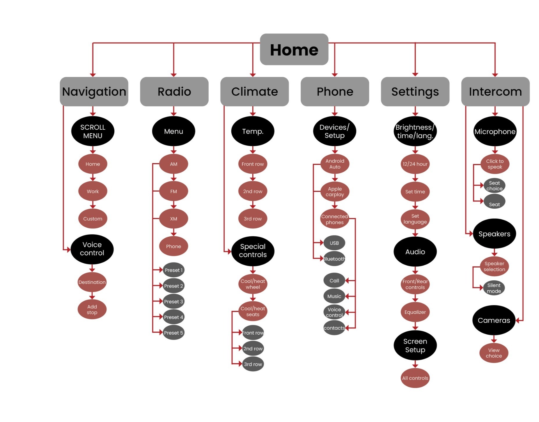
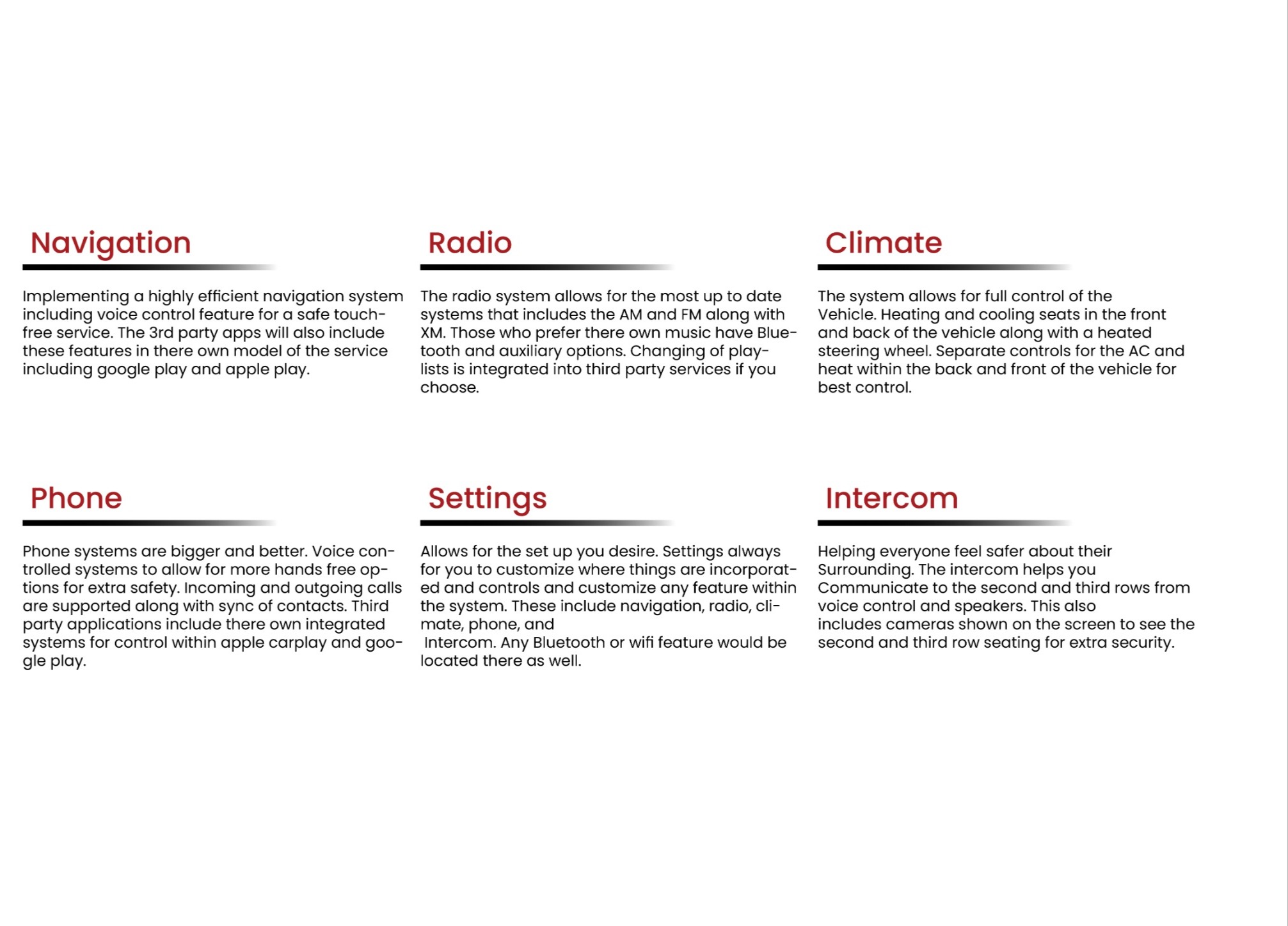
This chart highlights the core capabilities of the system, putting essential vehicle functions at the driver’s fingertips. It showcases navigation with clear turn-by-turn guidance, a full media suite (FM/AM/XM, presets, and phone audio), intuitive climate controls, and customizable settings for layout, brightness, and sound. Integrated phone features, voice controls, and an intercom with camera views and seat-by-seat audio help support safer, less distracted driving and a more comfortable experience for everyone in the vehicle.
Low-Fidelity Sketches
Low-Fidelity Prototype
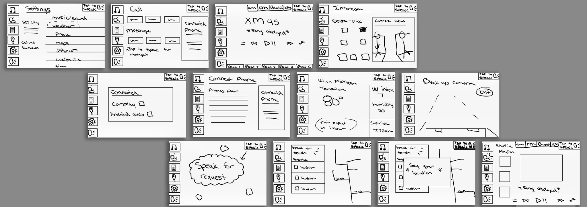
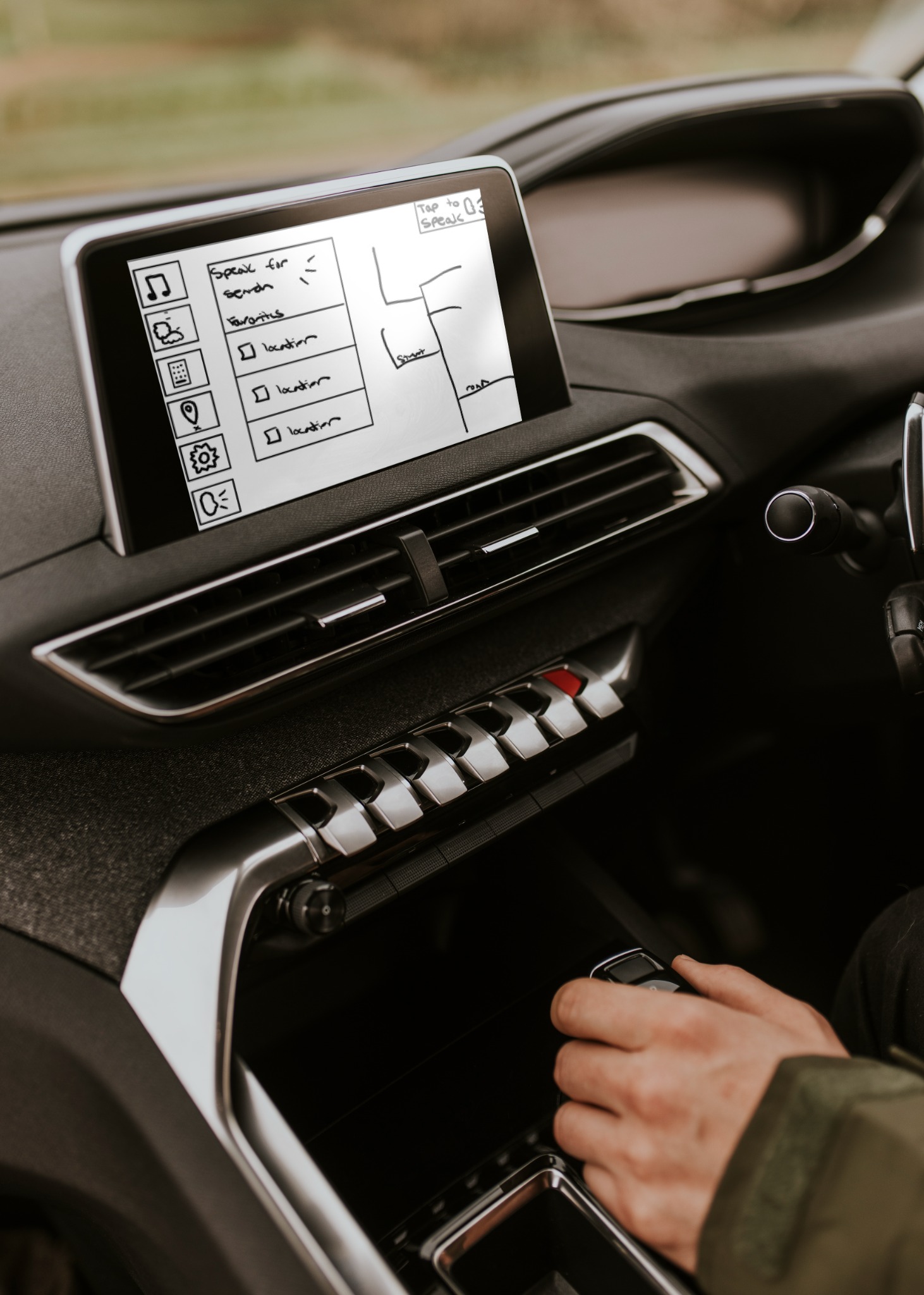
These rough sketches help bring light to the concept behind the features included. These low-fidelity pieces will be taken into Figma for a more in-depth and better view of the interface system. Through many various research of other systems, including GMC’s prior one this layout of sketches is going to be used to create a better capable system to fit the need of the user. This design is used to help test if the capabilities meet the protocols to be a safe and easy-to-use screen. Below has a usability test that is to help get view points if the system is good or if it needs any bug fixes. Using my initial sketches as a foundation, I will utilize the Figma program to create a detailed and interactive working prototype mock-up. This process is essential for ensuring that the design is both user-friendly and functional, meeting the needs and expectations of its intended users. Starting with low-fidelity sketches allows me to map out the basic structure and flow of the design. Gradually transitioning from low-fidelity to high-fidelity prototypes will help refine the details and enhance the visual appeal, ensuring the final product provides a seamless user experience. Conducting usability tests is a critical step in this process.
Usability Testing
To validate the low-fidelity prototype, I conducted a moderated usability session with a 20-year-old daily driver who relies heavily on in-vehicle controls for navigation, making calls, and playing media. During the 30-minute test, the participant completed core tasks across six features:
-
Maps: Starting a route and handling a reroute when a street is closed
-
Phone: Initiating and ending a hands-free call
-
Weather: Checking the forecast for the next day’s drive
-
Settings: Adjusting screen brightness and audio volume
-
Intercom: Broadcasting a quick message to rear-seat speakers
-
Music: Playing, pausing, and skipping tracks
The tester noted that the oversized icons and uncluttered screens made each function easy to find and remember—critical for keeping attention on the road. Consistent placement meant controls quickly became muscle memory, and the standalone intercom feature was praised as a natural way to check on passengers without the complexity of CarPlay.
These insights confirmed our direction: large touch targets, predictable layouts, and integrated voice/intercom controls before advancing to high-fidelity mockups and a second round of testing.
Icons, Dialogs, and Alerts
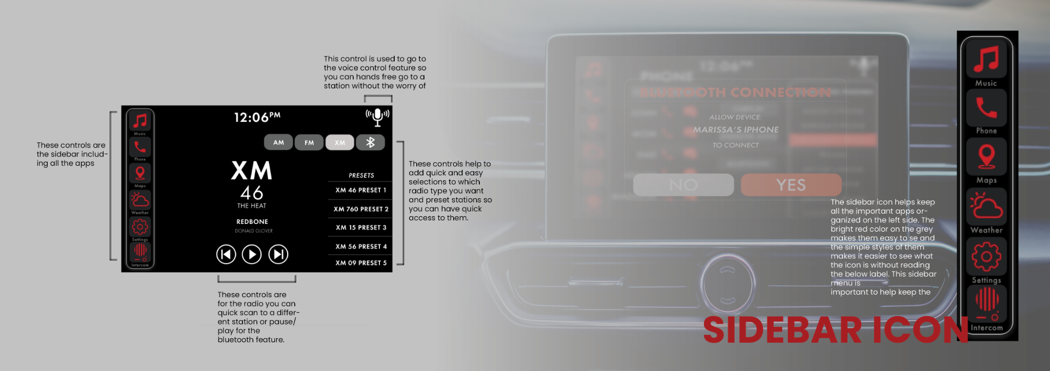
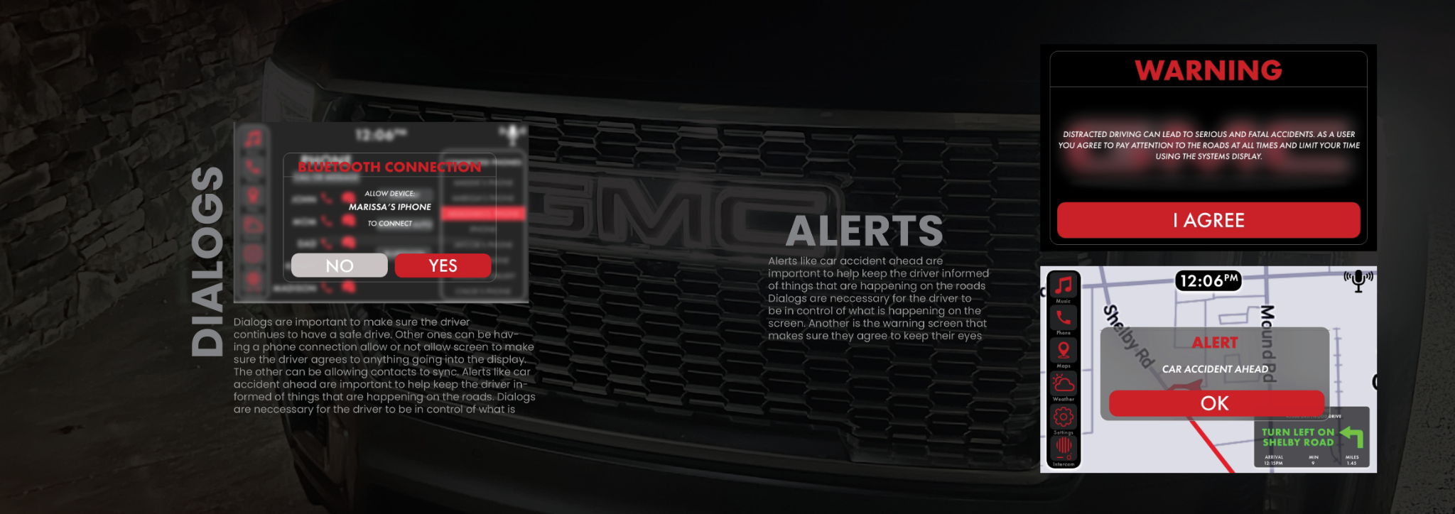
Phase 3: Design Foundations and Visual Identity
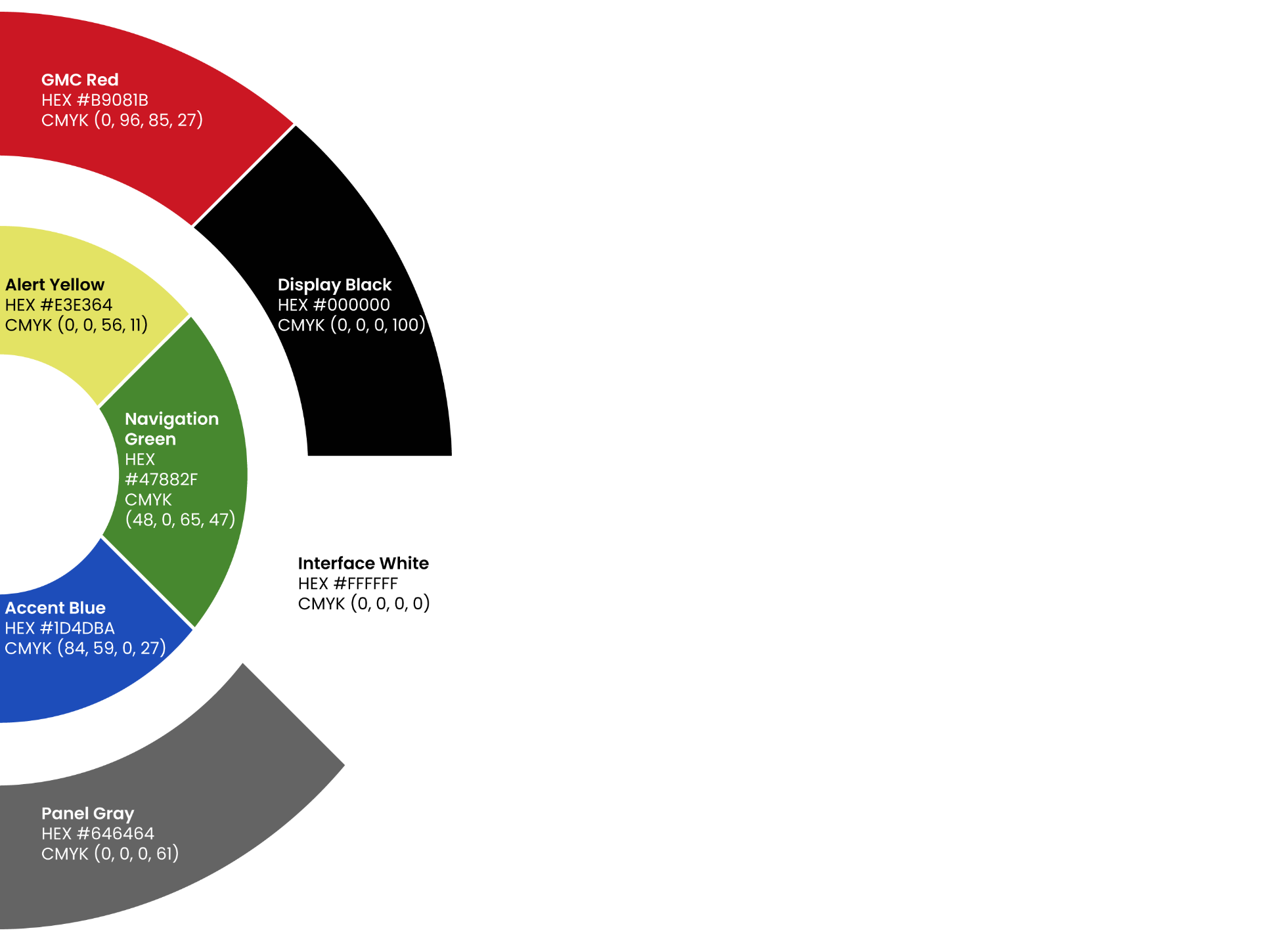
Color Palette
The color palette below is based on red, black, red, and grey RGB colors. The secondary colors yellow, blue, and green are used for accents to help identify logos fast in different systems, like weather, climate, and maps. The colors help create simple visuals with been regularly seen so it makes them less distracting and easier to see wherever you are. The red with the primary makes the logos pop more for quick visuals, knowing what you're clicking faster so ot limits distracted driving.
The Font
The chosen font for the infotainment system was the Futura PT typeface. Was created by a German designer, Paul Renner , between 1924 and 1926 for the Bauer Type Foundry in Germany. This font was picked for its simplicity of it. It has a few different styles to keep it unified, but it distinguishes when it is a different spot to be reading. This font has been known for looking sharp and approachable, making it a great text for quick viewing on an infotainment system to get the information across quickly.
Phase 4: High-Fidelity Screens and Second User-Testing
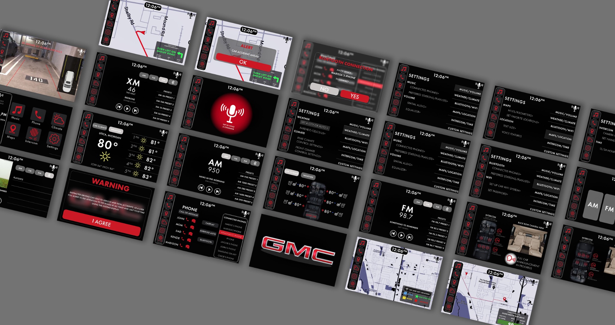
High-Fidelity Prototype
Usability Testing
To validate the polished prototype, a 30-minute session was conducted with a test subject (age 23) who regularly uses in-car infotainment systems. The goal was to confirm that all interactive elements (Maps, Phone, Weather, Settings, Intercom, and Music) worked seamlessly at full fidelity.
Core Tasks
-
Navigate with Maps: Launch a route, reroute when prompted, and confirm turn-by-turn alerts
-
Manage Calls: Place and end a hands-free phone call, and handle permission dialogs
-
Check Weather: Access current conditions and forecast screens
-
Adjust Settings: Change screen brightness and audio levels via dedicated controls
-
Use Intercom: Broadcast a message to rear-seat speakers and confirm intercom status
-
Control Music: Play, pause, skip tracks, and view track details
Key Findings & Iterations
-
Generic Icons: The subject praised the use of universal symbols—icons immediately conveyed function without labels.
-
Alert Feedback: Permission and warning dialogs appeared at the right times, though a few alert messages were trimmed for brevity.
-
Text Legibility: Some on-screen text was noted as too small; font sizes for secondary labels were increased.
-
Prototype Links: A handful of prototype hotspots were missing—these were added to ensure every button led to the correct screen.
After incorporating these tweaks like larger secondary text, streamlined alerts, and complete linking—the system demonstrated smooth, intuitive navigation across all features. pressed initial confusion over the small icon used to access the video library.
Phase 5: Final Delivery and Conclusion
Conclusion
This project presents a forward-thinking approach to modern car infotainment systems. With integrated features like voice control and a more intuitive layout, including refined sidebar placement, the system is designed to deliver essential information to drivers while reducing distraction and promoting road safety. From the beginning, the primary focus has been on safety and limiting distracted driving. Interviews and usability studies show that the system is user-friendly, while also revealing several bugs and usability issues that still need to be addressed. This prototype establishes the foundation of the design, and future testing and iterations will continue to refine and improve the system.

