
Doquspace, owned and developed by Interactive Training Systems, Inc., is a cloud-based enterprise platform that unifies document management, training delivery, and team collaboration in a single interface. Users can upload and version policies and procedures, build and assign multimedia training modules with quizzes, and discuss any document in real time. Administrators gain role-based permissions, automated reminders for retraining or content updates, and analytics dashboards to track compliance and engagement.
Company: Interactive Training Systems Inc. ● Role: UX Researcher/Designer
Tools: Google/Adobe Dreamweaver/Figma ● Deliverables: Usability Audit and Web Interface
Phase 1
Research & Stakeholder Alignment
Phase 2
Usability Testing & Key Findings
Phase 3
Evaluation & Future Strategy
Phase 4
Pitch Site Redesign & Delivery
As companies are making the switch from paper-based manuals to online training modules, there is a higher demand on the tech companies to streamline this switch. Doquspace answers those needs with an all-in-one hub combining training modules and document management into one intuitive solution.
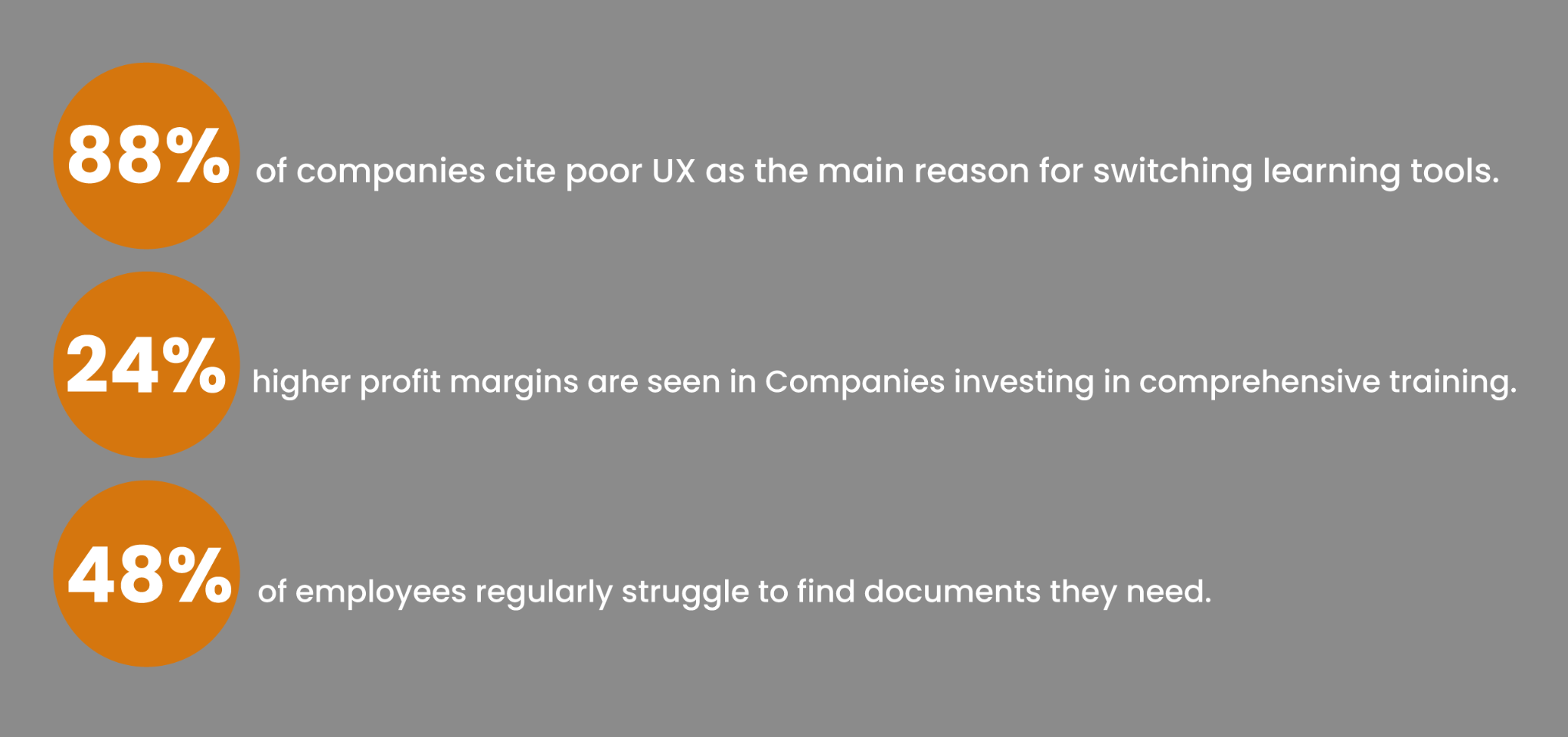
Insights to guide Doquspace toward market-leading design include:
These figures highlight the demand for an intuitive platform like Doquspace. As the UX designer, my focus is on elevating usability to reduce these search-and-retrieval percentages and deliver a seamless experience.
In an initial stakeholder interview with the Owner and Chief Technical Officer of Interactive Training Systems, we clarified the vision for Doquspace and the outcomes she wanted from this project. Her primary goal was to create an all in one hub where companies can store, distribute, and track training materials and internal documents. She also wanted the early digital prototype stage of the live platform evaluated to identify usability gaps before further development. This set the direction for a four month deep dive into Doquspace, where we analyzed real user behavior and documented points of confusion through structured user testing. Alongside the platform audit, we delivered a refreshed, more user friendly promotional pitch site to better communicate the product’s value to prospective clients.
Testing revealed two main problem types: system bugs that prevented expected behavior, and UI patterns that worked correctly but confused users. These themes guided the prioritized recommendations and the promotional site redesign.
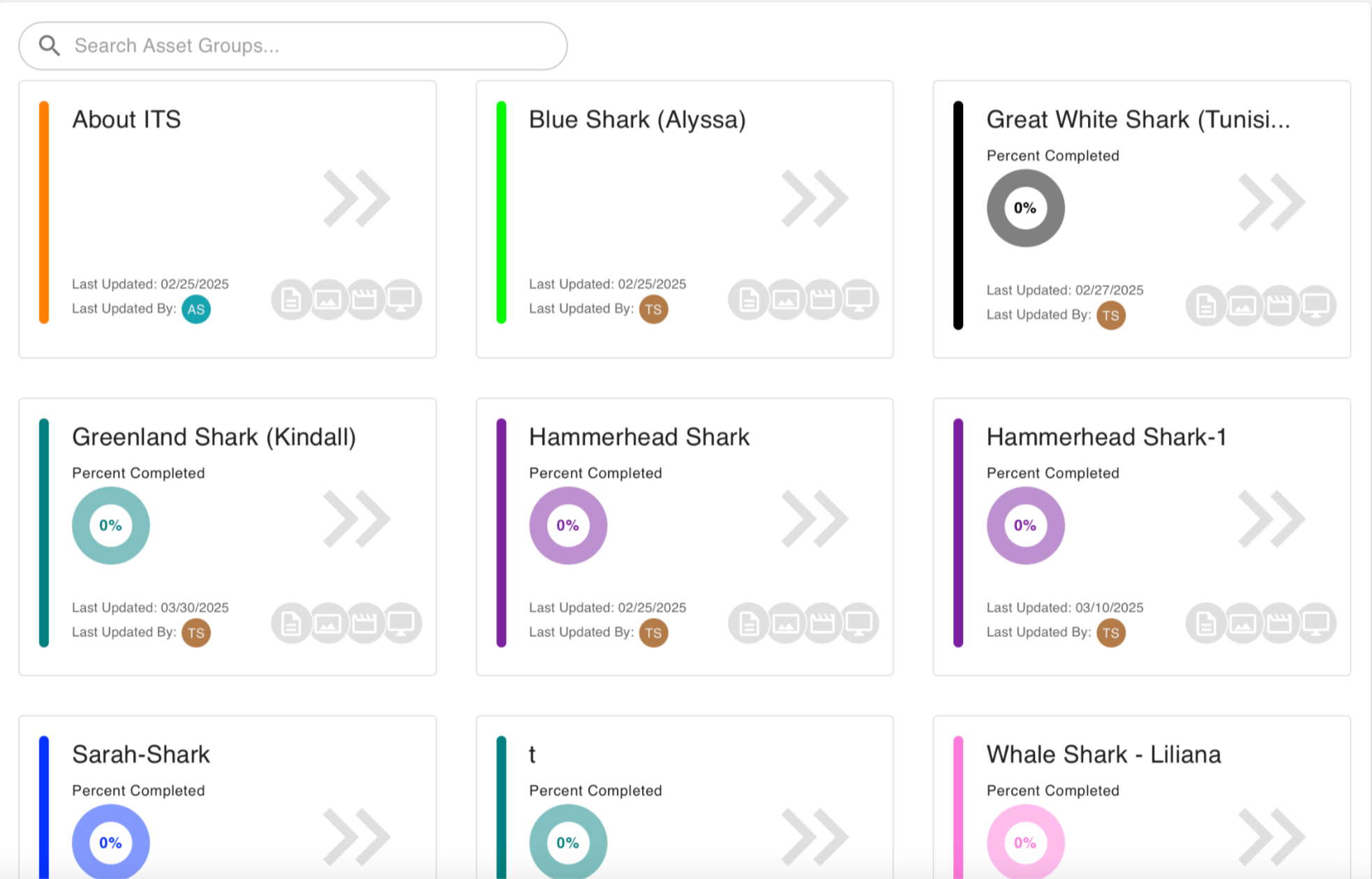
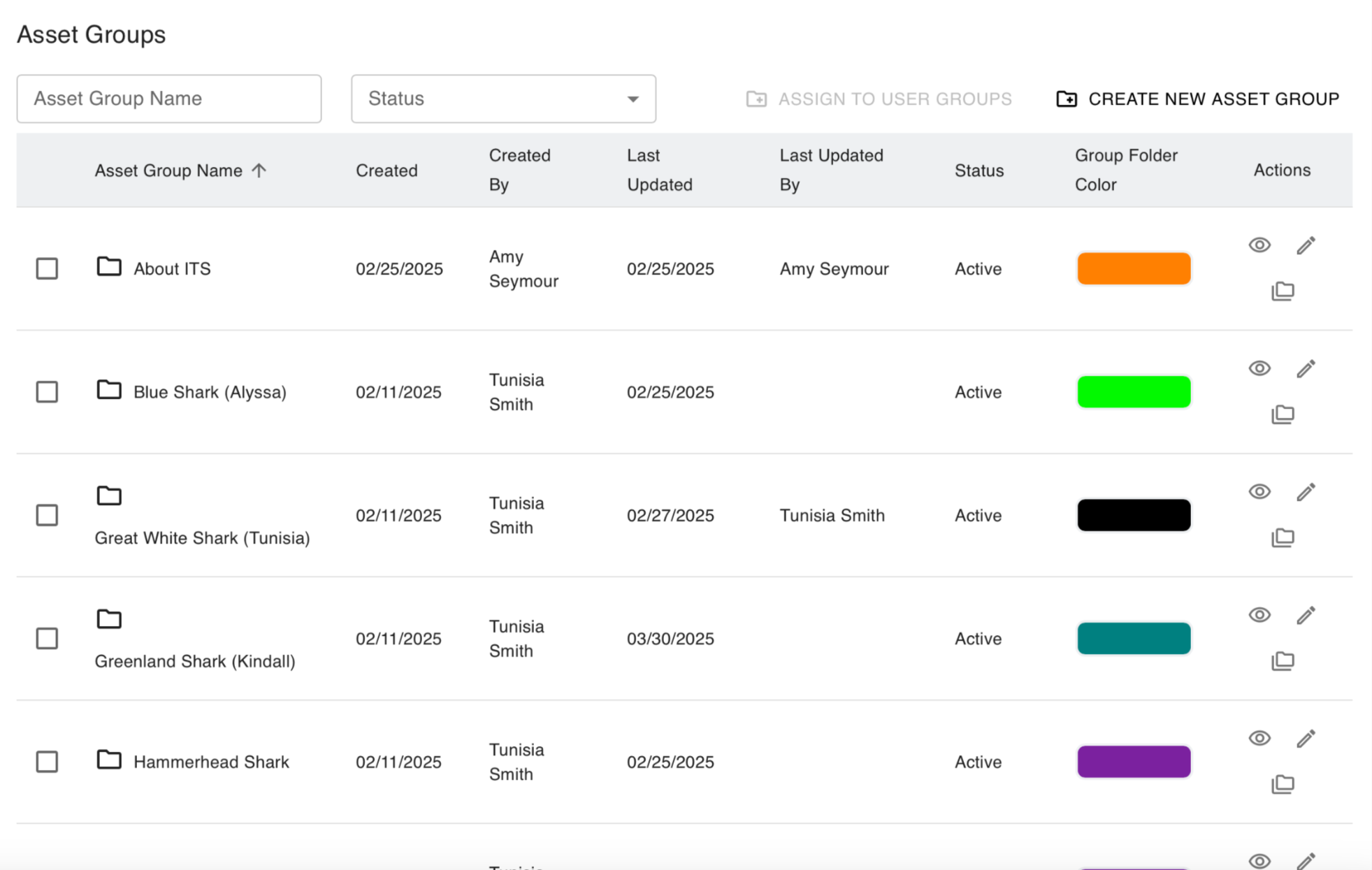
Several users could not complete account creation due to broken email or sign up flows, and those who reached User Groups struggled to locate the Add Users pathway. Greyed out actions, unexpected icon meaning, and no confirmation feedback made the process feel error prone.
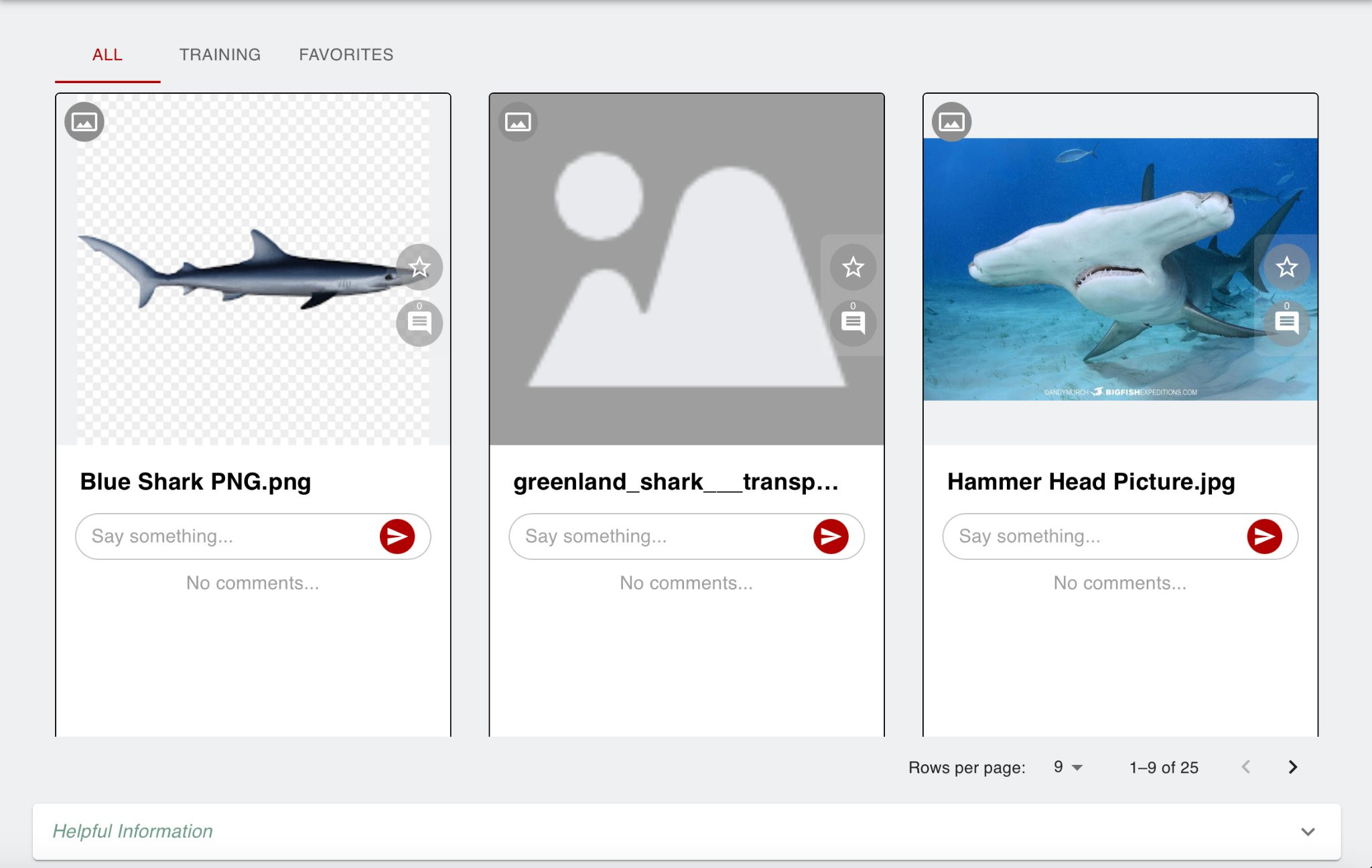
Users found the Newsfeed confusing because assets were shown in one long stream with no clear organizational system, and no dates to help them tell what was new versus old. This lead to many users not being able to assess the data.
Participants did not understand what “QRL” stood for, and the word “Quick” led them to expect a short preview area instead of a place for full training manuals. They also struggled to tell training modules apart from non training items in the same space.
Moderated usability tasks on the live Doquspace platform showed that users could usually understand the goal of each workflow, but ran into friction from unclear UI patterns and several system level failures. Across three core tasks, adding users, adding assets, and completing training, participants consistently hesitated around terminology, icons, and feedback states. The eye icon was interpreted as view or hide rather than add, disabled actions and greyed out buttons felt broken, and users could not always tell where training lived or how to complete it. Testing also surfaced functional bugs that blocked successful onboarding and reduced trust in the training system, including missing registration emails, incorrect signup routing, training percentages that stayed at 100 percent or did not update, and browser or mobile performance issues.
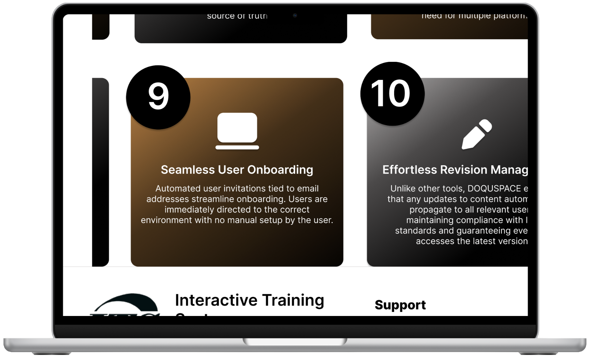
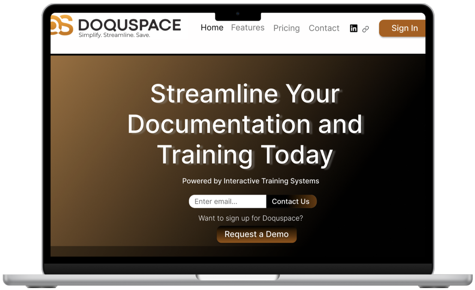
High-fidelity mockups were developed and reviewed before code development to refine the pitch site’s usability and strengthen how Doquspace is presented to potential clients.
Below is the redesigned promotional website for their existing site. The updated layout presents a more user friendly experience, built in Adobe Dreamweaver using HTML and CSS to create a cohesive, responsive design.
