
Timber Nation Tree Service provides professional tree care, from removals and trimming to seasonal maintenance. This brand refresh emphasizes their reliability, respect for the environment, and pride in hard work, using bold visuals that feel rugged, trustworthy, and rooted in the outdoors.
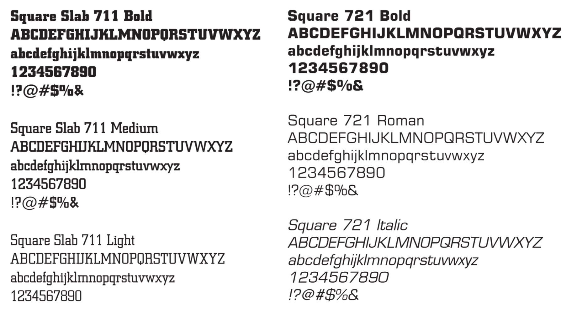
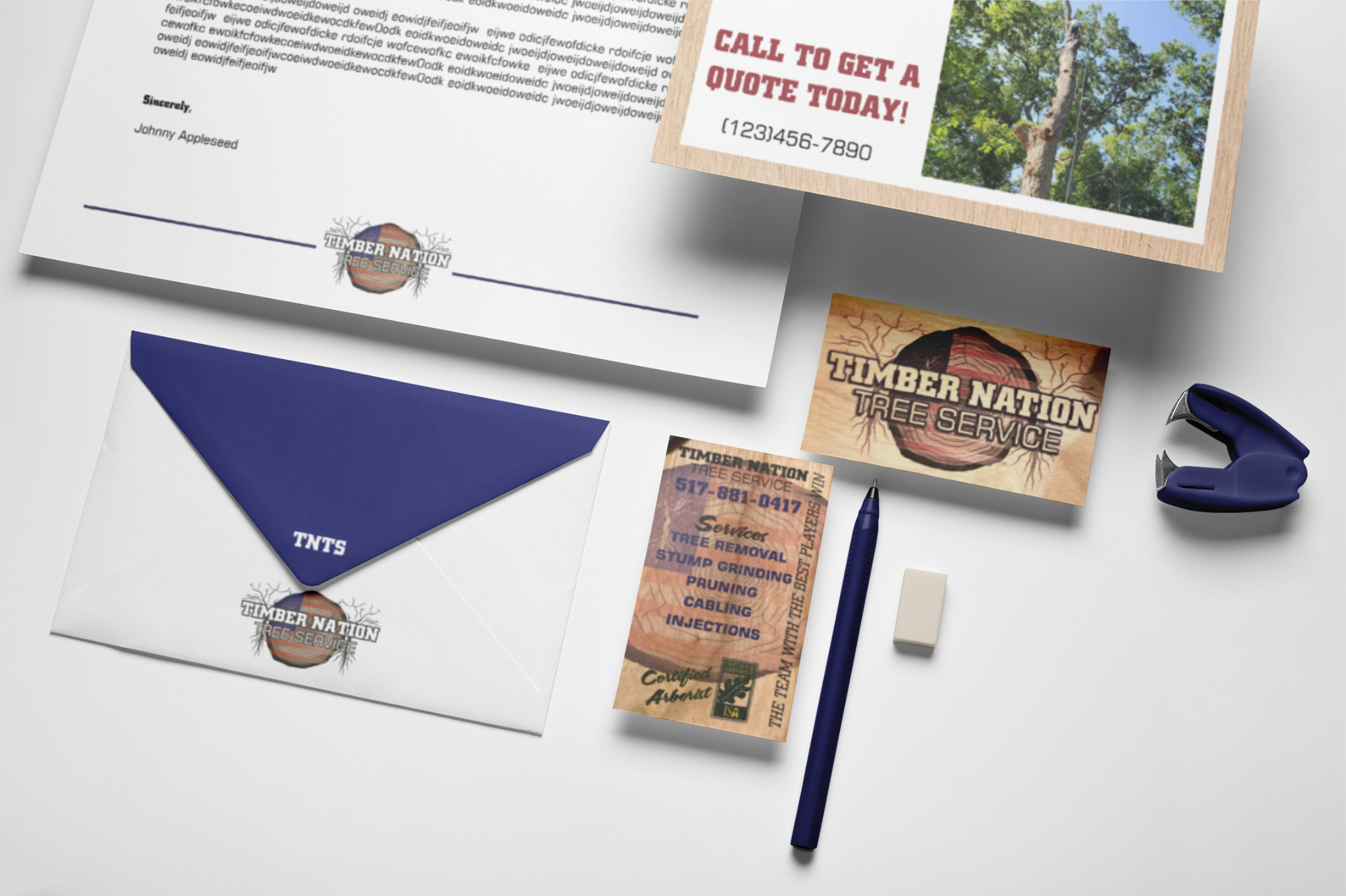
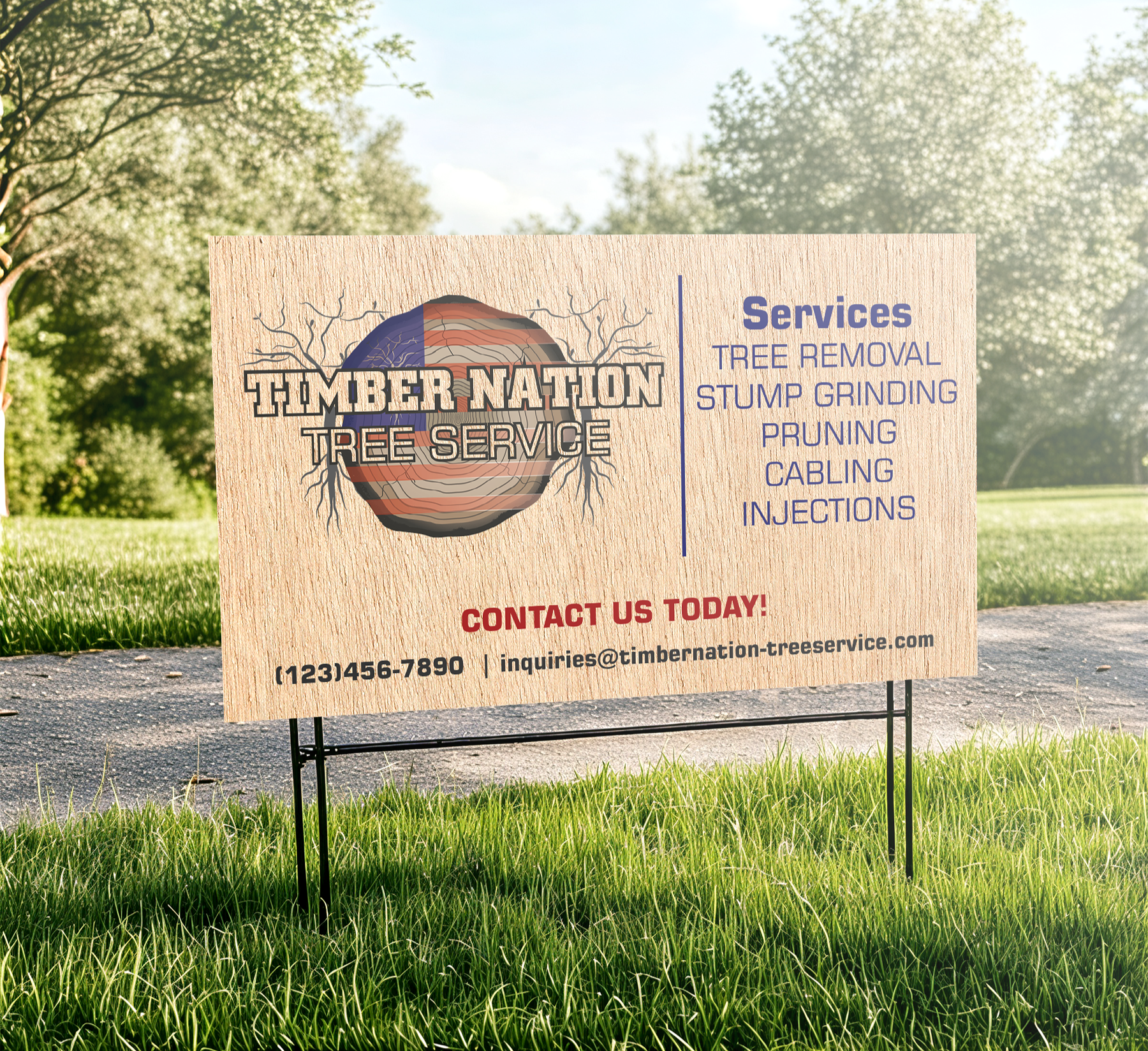
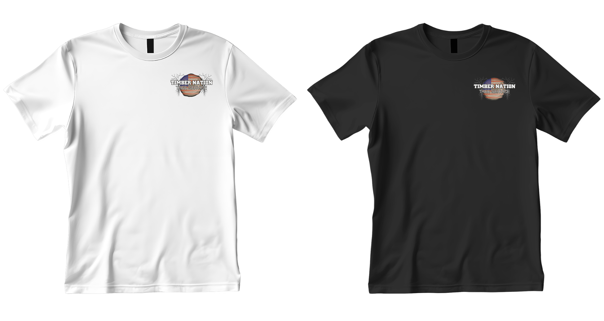
The completed brand reflects the company’s values of safety, honesty, and craftsmanship. The project included a new logo, refreshed typography, and a cohesive visual system for business cards, yard signs, equipment decals, and digital use.
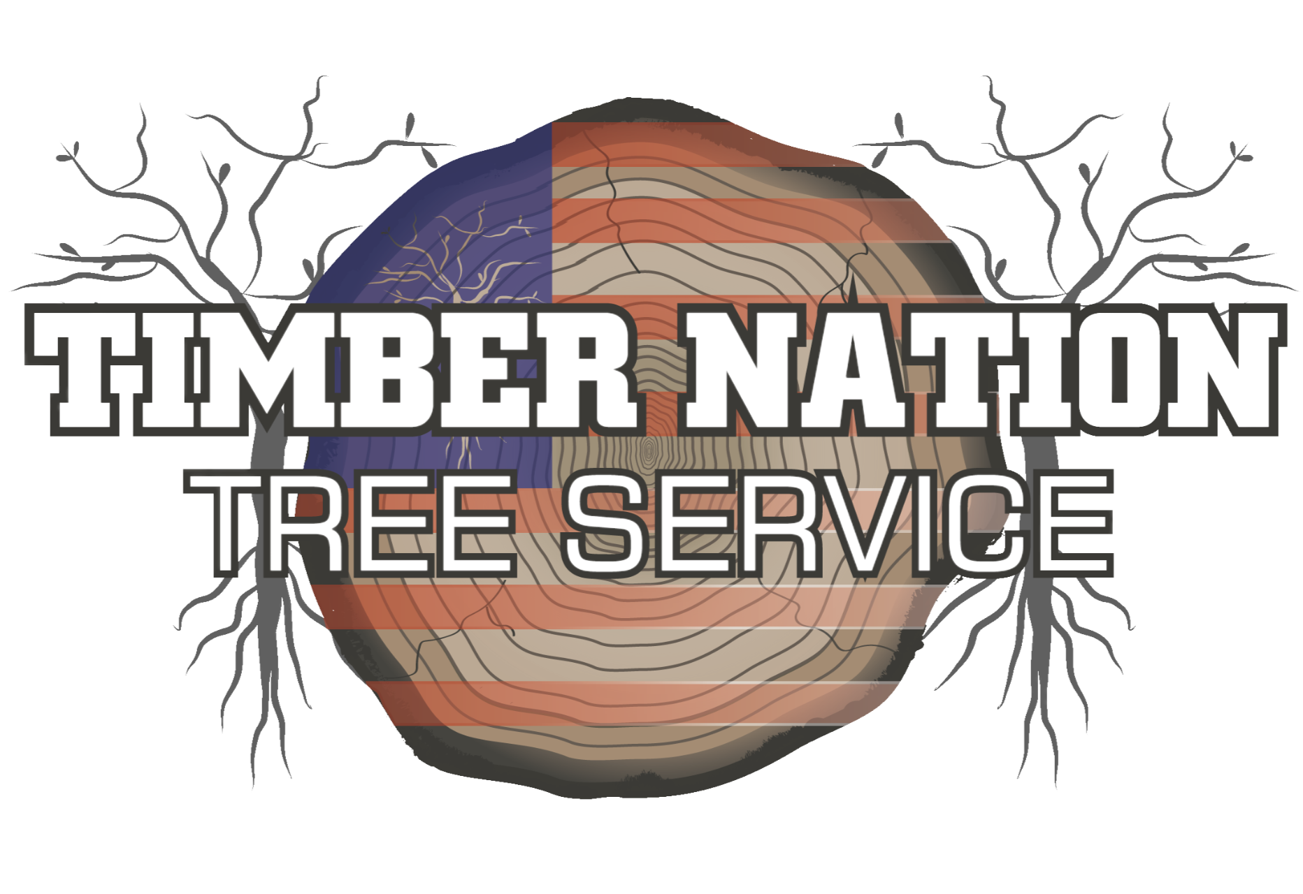
The logo centers on a cross-section of a log, symbolizing longevity, strength, and the core of Timber Nation’s work. An American flag motif is woven into the growth rings, highlighting the company’s pride in serving local communities. The bold, block lettering ensures the name remains clear on trucks, equipment, and signage, while the subdued wood tones and muted red, white, and blue palette balance ruggedness with professionalism.
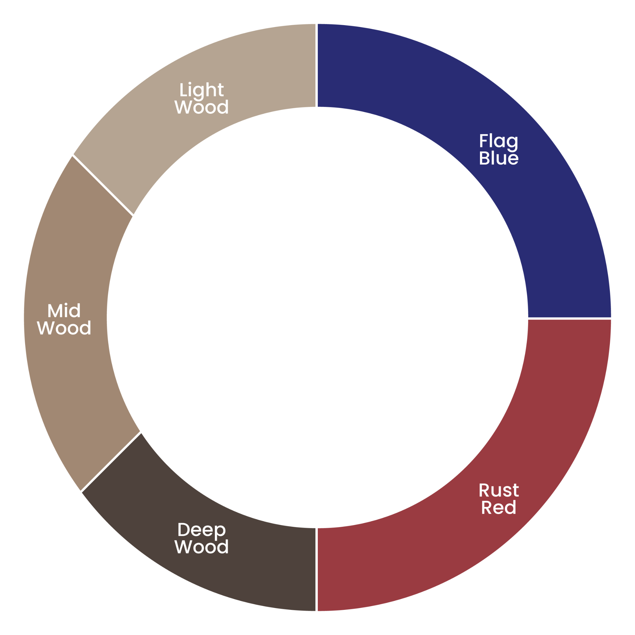
Flag Blue
HEX: #292C74
CMYK (65, 62, 0, 55)
Rust Red
HEX: #9A3B41
CMYK (0, 62, 58, 40)
Mid Wood
HEX: #A18873
CMYK (0, 16, 29, 37)
Light Wood
HEX: #B5A492
CMYK (0, 9, 19, 29)
Deep Wood
HEX: #4E423C
CMYK (0, 15, 23, 69)

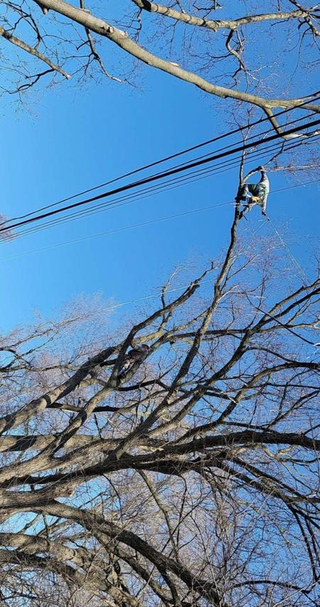
Brand imagery leans into natural textures and working-day details, featuring wood grain, bark, sawdust, and tree lines. Photos of equipment, in-progress jobs, and finished clean-ups reinforce a hands-on, dependable tree service. Together, these visuals create a straightforward, no-nonsense mood that feels hardworking, outdoorsy, and grounded in the landscapes Timber Nation cares for.
